Monday, August 31, 2015

Tools: Folding Basics

One of the most fundamental of card-making tools is the bone folder. This handy tool allows you to fold even 120# card stock without it looking like a kindergartner folded a piece of construction paper against the grain and awkwardly pressed the crease.

My apologies if I offended any kindergartners.

Anyway, paper is made of fibers that, in the case of machine-made paper, generally line up either parallel to the short or long edge of the paper. That is called the grain. If you fold paper against the grain, it will look terrible...all crinkly and weird...unless you score the paper first with a bone folder and then smooth the crease with the bone folder.

Then, it looks just fine.

If the paper is thick, even folding with the grain looks better when you've scored.

So you need a bone folder.


Teflon folding tool, plastic folding tool,
 and a butter knife.
Most bone folders these days are not actually made of bone...but back in the good ol' days, they were made of real bone so the name stuck. You can find plastic bone folders like the middle one above that are very affordable at roughly $5, but that would, in my experience, be a waste of $5.

The best bone folders are made of Teflon and will cost you around $23. Given that you will use this tool on every single card you make, it's worth every penny.

Bone folders have two primary purposes.

1) Bone folders will SCORE paper, leaving an indentation that breaks down fibers and allows easy folding. You can score by running the bone folder over the paper using a ruler as a guide, or you can use a specially designed, grooved plastic panel such as the Scor-Pal (see picture below). Now, you don't really need a Scor-Pal (who am I kidding...of course you need one).

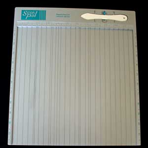
This is the older version I own.
The bone folder that comes with it is plastic and useless,
 and you should throw it away. The Scor-Pal itself is fabby though.
Basic scoring can very cheaply and easily be accomplished with a butter knife and ruler. I did this for several years when I was getting started. Occasionally, if I'm scoring really, really thick paper, I'll score first with my teflon folder and then go over the score again with the butter knife to break down the paper fibers even more. Also, I used the butter knife for scoring the vellum panel on this card. They are handy for sharp scores, and generally, everyone has one in their kitchen that hardly ever gets used. Why not put it with your craft tools instead?

2) Bone folders will also BURNISH paper. Burnishing smooths folded paper flat (especially important with the heavy card stock I use), and burnishing also bonds glued paper to mat board (generally only applicable for book binding). Now, here's why you need to buy a Teflon folder rather than a plastic one: plastic folders leave unsightly shiny marks on paper after burnishing. 

What is a crafter to do??!? Well, you could put a piece of waxed paper over the paper and burnish through that, or you could burnish the back of the card so the shiny bits won't really show. I did both of these things for years. Or you could spare yourself the anguish and inconvenience and buy a Teflon bone folder

And if you don't trust me, perhaps you should know that I first learned about Teflon bone folders from Her Royal Rubberness Julie Ebersole herself. Seriously, they are amazing.

Butter knives are not suitable for burnishing because the edges are too sharp.

The bottom line: For picky stampers, I highly recommend a Teflon folder and some sort of scoring board (I use the Scor-Pal, but others look basically the same). I use these two tools every single time I make a card.

Every.

Single.

Time.


Sunday, August 30, 2015

Turn a Boo-Boo into Something Cool

While playing around with my irregularly-sized watercolor paper cards, I made a boo-boo card. It started with this pretty blue sponged strip and a sentiment about winter, and then I stamped silver snowflakes with Brilliance silver ink...and the ink just disappeared into the rich blue.

Ugh.

That's what I get for not embossing those snowflakes. Take the easy way out, and sometimes you fail.

So I cut off the front of the card, leaving about three inches, planning on using the scraps for other cards, but then this idea just popped into my head, so here you are: a boo-boo turned into something cool.


card size: 7 1/4" x 3 1/2"

The strip on the front was one of the leftover scrap pieces from the giant sheet of watercolor paper, which was trimmed to fit in length only. It's attached to the flap with dimensionals.

The outline leaf image was stamped in Memento cottage ivy. To fill it in, I rubbed two shades of green watercolor crayons on the block stamp, spritz with lots of water, and then stamped. Unfortunately, the greens of my watercolor crayon set don't seem to work so well...the first impression was really light. So after spritzing again and waiting a bit for the water to dissolve the pigment, I stamped again and got a bit better color.

Yay!  I'm giddy!!!

There are no mistakes...only opportunities for embellishment.

A Question
Would it be helpful if I wrote posts on my favorite stamping tools? Inquiring minds and all that.


Supplies
stamps: Simon Says Stamp One with Nature
ink: Memento cottage ivy, cocoa
paper: Windsor & Newton watercolor paper
accessories: Papertrey twine, SU dimensionals, watercolor crayons, water spritzer

Saturday, August 29, 2015

Happy Birthday: Four Colors and Two Neutrals!

Here's a birthday card that's colorful, fun, and utterly random!


This inspiration for this card is somewhat complicated so numbered list might help.
1. The use of vellum was inspired by Gayatri Murali over at Handmade by G3. She's been using vellum a lot lately with stamped backgrounds on her gorgeous cards, and I just had to use some.
2. The color scheme came off this Pinterest pin on my Color my World board.
3. The layout idea (with the wrapped label) came from this Pinterest pin on my Pure Inspiration board.

Now, as I have said before, random backgrounds are NOT really random. When I stamped this one, it was with the intention of making the panel portrait-oriented, but then I couldn't find a sentiment that worked well, so I turned it to landscape. Which is fine, but the not-random arrangement is a bit off. Unless you look closely, though, I think it still looks fine. If you are interested, here's my tutorial on so-called random stamping.

The vellum strip is wider than the panel. I positioned it where I wanted it, carefully inverted the strip and panel on my cutting mat, and used a butter knife to score the sides of the strip. This makes the fold crisper and tighter. Then, each flap was folded down onto the back where an ugly strip of tape holds it in place. This means there's no need for adhesive under the vellum on the front of the card. Most tape WILL show through vellum (though a few are barely visible if you do it right). But I really wanted the idea of the wrapped label from Pinterest, so I adhered where it definitely doesn't show.

Note that there are FOUR colors on this card, although admittedly the two blues look nearly identical. They are VersaMagic Ocean Depth and Tea Leaves, and Memento Luxe Pear Tart (hee, hee...she typed "pear") and Teal Zeal. The Teal Zeal is a few shades lighter than the Ocean Depth, but with these outline stamps the difference barely registers, which is proof again (as if we need it!) that you can never

have

too

many

ink

pads.

Because I sure could use a lighter shade of teal blue.

*sigh*

The neutrals are, of course, black and white. The black ink is Memento Tuxedo...not Memento Luxe, because the pigment inks take forever to dry on vellum and I am not a patient crafter.

And that is all I have to say about that.

Supplies
stamps: Mama Elephant Freestyle Flowers; Papertrey sentiment
ink: Memento Luxe, VersaMagic, Memento
paper: Papertrey white, vellum
accessories: dimensionals, butter knife

Thursday, August 27, 2015

Using My Hoard: Stipple Brushes

Stipple brushes are among the oldest tools I have in my craft hoard, but they rarely get used. Not sure why because they create such a unique and interesting background with absolutely no skillz needed. Just pounce that baby up and down until you get the color saturation you want, and BAM!


To make this card, I masked off the area to stipple, then started with light blue ink (Hero Arts Cornflower) and then added some Memento Paris Dusk to the bottom. When I removed the mask, I wasn't quite sure I liked the blue against the white...it seemed anemic, for some reason. So  using Papertrey's Faux Ribbon set, I added black lines that were heavier than the lines on the birds are on, and that created just the border needed between the blue and white. In the photo, it looks like a black mat to me, but it's definitely a one-layer card.

Let me make a small shout-out to Memento Luxe ink here. The tuxedo black is incredibly rich, dense, and BLACK. Those little birdies pop right off the blue background because that ink pad is SO INCREDIBLE.

If you don't have one, get one!

Yep. You've got a friend in me.

Or enabler.

Whatever.

Supplies
stamps: Penny Black Happy Notes; Papertrey Faux Ribbon, Keep It Simple Thinking of You
paper: Papertrey white
ink: Memento Luxe tuxedo black; Hero Arts cornflower; Memento Paris dusk
accessories: post-its for mask, quilt ruler for placing post-its, stipple brush

Tuesday, August 25, 2015

When Bling Matters

Today's little card needed a little something-something, and bling was it.

Sized 3 3/8" x 4 3/4" to fit a small envelope
in my stash.


Note how I used the deckle edge of the watercolor paper as the bottom edge of the card. On purpose.

This card uses the same technique as this one, I inked with green Kaleidacolor ink (from Caribbean sea), spritzed, stamped, and then very quickly repeated with the blue. I love how the blue bleeds into the yellow-green and makes a blue-green. Once the strips were completely dry, I added the sentiment using Memento Luxe ink for a crisp, solid coverage.

Without the bling the card was okay, but your eye went straight to the sentiment and stayed there. While those colors are simply fabulous, the design was incredibly static. But by adding the bling, your eye has to move across the strip, which makes the whole thing far more interesting.

Plus, well, it's BLING. And I've said it before and will say it again, "Bling makes everything better."

Don't you agree?

Supplies
stamps: Clearly Besotted A Little Sentimental, Papertrey Watercolor Wonders
ink: Kaleidacolor, Memento Luxe
paper: Windsor and Newton Watercolor, 90lb hot press
accessories: water spritzer, rhinestones


Monday, August 24, 2015

No Regrets

Okay, so I do have some regrets...those purchases that clearly were stupid and silly and filled me with buyer's remorse and self-loathing.

"Will I ever learn?!?!"

Probably not. But hey, I just, for the second time in my life, used up a whole tube of ChapStick without losing it first. I suppose that means there must be some hope for me.

Or not.

Whatever.

Anyway, after deciding RESOLUTELY that I did not, under any circumstances, need even one more Kaleidacolor ink pad, I bought Vineyard. Because (and you know this, don't you?) it was so pretty!

I played around with the pad immediately after I bought it and thought, "Meh. Why'd I buy this?" And quietly banged my head on my desk in despair.

Today, however, I'm feeling no regrets. This card is why I bought Kaleidacolor Vineyard:


As soon as I finished it, I knew exactly who will receive it. Our niece announced last week that she and her boyfriend are getting married. Yay!!!! I'm going to send this to the happy couple. The color scheme isn't too girly, which feels appropriate for a couple, don't you think?


The close-up shows the fabulous olive fading into the grayish teal, then brownish purple, dark plum and finally lavender.

Happy sigh. I think my new motto for crafty purchases is "No Regrets." Eventually, you will make something work for you.

And if that's not a sure-fire plan for getting my own episode of Hoarders, I don't know what is.

Supplies
stamps: Penny Black Happy Notes
ink: Kaleidacolor Vineyard
paper: Papertrey white
accessories: none


Sunday, August 23, 2015

A Study in Contrast

Today's card is crisp and clean, like a bright autumn day.


Crisp, clean, autumnal

The color here is Ancient Page Henna, which is a glorious burnt red color. This ink stamps so crisp and clean (although it does stain photopolymer, if that bothers you). The pointy banner keeps the design crisp, as does the all-caps classic font of the sentiment. The two rhinestones anchor the banner, To get the color right, I started with brown rhinestones and added red Sharpie.

Contrast that with yesterday's card, which has a nearly identical layout. The lavender is cool and soothing, and there's nothing really "crisp" about this with the fuzzy flock as the dominant element. The font is certainly crisp, but I find with this complex botanical stamp, fussy fonts get lost or look kind of chaotic.

Soft, fuzzy, serene

Same basic card, completely different feel. Y'all, I never get tired of doing this with layouts. Change a few key elements, and the whole thing changes.

Do you like playing around with color like this? Sometimes I find a design works great with one color scheme but doesntt work in another. Sometimes, too, an image can be incredibly flexible, like this fabulous Penny Black stamp that can be energized or subdued.

I'm so glad I bought this set!!!! You'll see more of it in the next couple of days. It's chameleon-like!

Supplies
stamps: Penny Black Happy Notes
ink: Ancient Page Henna
paper: Papertrey Ink
accessories: dimensional, square punch (used just one corner to notch the banner), brown rhinestones, red Sharpie marker

Saturday, August 22, 2015

Soft Sympathy

I'm out of sympathy cards again, so I decided to go soft and gentle with the fabulous plant stamp from Penny Black's Happy Notes set and some light purple flock.


Here's a close-up of the flock...the color on the close-up is closer to the real color. Editing pastel-colored cards can be tough!


I love the soft, tactile quality cards with flock have, and the lighter colors are perfect for soothing, comforting cards. Lavender used to be an acceptable color for ladies in mourning to wear, so its use on sympathy cards has a historic justification as well.

The pointy corners of the sentiment strip looked harsh, so I pulled out a pair of scallop scissors and snipped the left-hand corners. It's a small touch, but it makes a difference in the overall feel of the card. I didn't snip the right-hand corners because they line up with the sharp edge of the plant image.

Remember that the design principle of UNITY requires that all the elements of a card work together to reinforce each other. If I'd used hot pink flock on this card, for example, the sentiment would have to be different...something happier to match the flashy color.

To adhere the flock to the card, use the Essential Glue Pad. Some quick tips for success: a) work quickly, b) press the flock onto the glue using your fingers (just sprinkling it won't make a nice bond), c) thump off the excess flock gently, and d) let it dry for a VERY long time before touching it.


This is my second Essential Glue Pad; the first got too dried out and too hard to use. It's important to reapply the glue to the pad before each use, especially if you haven't used it in a while. Eventually, the pad will get hard with dry glue. It will work for a while, even when it gets pretty stiff, so don't throw it away prematurely. These things are expensive. I really should use it more often, but while it works great with flock, I find that it's less grabby of glitter.

Of course, I gave away all my loose glitter in exchange for a bunch of Stickles. Less mess, stays put.

And that's all I have to say about that.

Several people have asked for the names of the sets from yesterday's shopping spree post. Here you go.

Hero Arts: Holiday Pine Branches (CL899) and Holiday Greetings (CL890)
Penny Black: Happy Notes
Simon Says Stamp: To Thine Own Shelf

I ordered all four from Simon Says Stamp.

Happy Shopping!

Supplies
stamps: Penny Black
ink: Memento Luxe black
paper: Papertrey white
accessories: dimensionals, rhinestones, scallop scissors (to round the left corners of the sentiment strip)


Friday, August 21, 2015

Any Excuse to Shop and A Beautiful Card from Audrie

Funny story. So, I've been an Iron Sherpa for SEVEN Ironman races, meaning I woke at 4:00 AM to carry around bike pumps and fetch coffee, I've retrieved disgusting bikes coated in sticky sports drinks and sweat, and I've cheered my Ironman on all day and into the night. I even went to the Burger King drive thru at midnight when he DNF'd at Lake Placid because he wasn't hungry until then.

Not once has George given me a gift for being such a good athletic supporter (so to speak). In fact, I never even thought about getting a gift. (Don't tell him, but being an Iron Sherpa can be a lot of fun.)

Well, turns out my sister-in-law, Angela, has received a fancy gift for all three stints she's pulled as an Iron Sherpa for her husband, Mike. We're talking expensive handbags, jewelry, and such.

Harruph!

She talked it up good and shamed George into agreeing that I deserved an Iron Sherpa gift this year. He asked what I wanted, and I said, without thinking or hesitation, "Stamps!" He was relieved that I'd do the buying, and I'm thrilled to have an excuse to buy more stamps.

Check out the first installment of my Iron Sherpa reward!

Two new Hero Arts Christmas sets

A Penny Black set (Heather Telford inspired this purchase!) and
Simon Says Stamp's book set...for obvious reasons.
Woo-hoo!!! Now, can I make time to play with this goodness...and perhaps shop a bit more? Things might be calming down. The boys are through their first week of school and are mostly settled. I got rear-ended today in a minor car accident, but there doesn't seem to be much damage to the car. Will know more tomorrow. But I've GOT TO STAMP!!!

In the meantime, check out the gorgeousness that was waiting in my mailbox when we got home on Tuesday...

Card by Audrie Magno-gordon
I have been DYING to see the modeling paste in action, and here goes Audrie sending me happy mail with a hands-on example of it!  The black-and-white geometry here is FABULOUS!!! And that tile with the word "authentic"...how did Audrie know that word has been on my mind lately? Seriously. This is such a touchable card (I'd worried that the paste would dry hard, but it's flexible and survived the postal service beautifully), and can you believe how clean the black card stock is? Amazing and inspiring!


Close-up or Audrie's amazing card!


I should have taken a picture of the envelope as well because it was beautiful, too.

Thank you, Audrie. So very much!


Thursday, August 20, 2015

Some Color Ideas

Well, we are back in Ohio after a wonderful twelve days in Quebec. My husband finished his sixth Ironman race 18 minutes faster than last year and is still recovering from Sunday's effort. He'll be back on the bike this weekend for sure, but running might take longer.

Our kids missed the first day of school because of our trip, so this week has been insane with trying to get everything set up, inevitable problems worked out, and school supplies bought. So far, I've shopped five times for supplies, and we still don't have everything we need. It's a nightmare.

While I still haven't had time to stamp, I had some rainy days in Quebec to surf Pinterest for inspiration, and pinned lots of good stuff, mainly on Pure Inspiration and Color my World boards.

Kathryn Baldwin asked me a question on one pin that provides some interesting food for thought. She wrote,

"Just out of curiosity, do you have a personal standard or preference for the number of colors you use in a card? I find it difficult to go beyond three. And sometimes one of those is white or ivory or Kraft!"

Most of the pins on the Color my World board have five-color combinations...yet when was the last time you saw me use five colors on a card? Yeah, it's been a while, for sure. My favorite color combinations are either a) monochromatic, b) two or three colors, usually analogous (side-by-side on the color wheel), or c) two complementary colors (opposites on the color wheel).

So why spend so much time pinning five-color combinations on Pinterest?

Because those combinations just offer inspiration. We can pick and choose among the five and play with two or three of them...or all of them. Really, inspiration is just the jumping off point. And while we all have "favorite" colors and combinations, it's useful to stretch our creativity by trying combinations or colors that we don't normally use.

Color my World is perfect for that sort of inspiration, and that's how I use it.

How do you get color inspiration on Pinterest? Do you have a board specifically for color? How do YOU use it?

Inquiring minds, and all that jazz....


Friday, August 14, 2015

What I'm Doing Instead of Stamping

Our family is at Mont Tremblant in Quebec for this weekend's Ironman race! My husband, George, and our brother-in-law Mike are doing the race on Sunday.

If you're interested in following our time here, please check out my other blog Questioning my Intelligence. I'll be posting multiple times per day, taking you through the craziness that is Ironman. And man, is it crazy. Fun and nuts, all rolled into one!

Today's post on QmI gives some background on Ironman, so you can see if it's something you'd like to follow over the weekend. Keep checking back on QmI over the weekend for additional posts, especially on Sunday. I'll provide links for tracking the athletes as they go through this crazy race and a link to the live feed that will show them crossing the finish line. Hopefully, you'll see my husband cross the finish line as Mike Reilly announces, "George Raihala, you are an Ironman...for the sixth time!"

If all this sounds too silly for you, please ignore the shenanigans and know that I'll be back stamping (and blogging about it) in a week or so.

Peace, love, and craziness....


Sunday, August 2, 2015

A Blogging Break and Some Thoughts on Dye Ink

Giving you a heads-up that August will be kinda crazy for me, so posting on Simplicity will be sporadic at best. Do not be alarmed if there aren't posts for a week or more! Life's full of lots of good stuff for our family right now, but crafting time is going to be nearly nonexistent for most of the month.

Still, despite all the goodness going on, I'm looking forward to the end of the month and more time to create! I'm contemplating some new and different paper-crafty stuff (not just cards), and would love to hear if you have any particular requests for what you'd be interested in seeing on this here corner of the interwebs. Please share your suggestions in the comments below or email me at susanraihala at roadrunner dot com.

Can't wait to hear what you have to suggest!

In the meantime, I do have a few cards left to post. This one, which I made yesterday, thrilled me with its simplicity and the high-impact, bold autumnal colors.


The card base is made of Windsor & Newton watercolor paper. I took a large sheet (22" x 30") and cut it into sizes to fit odd-size envelopes that have collected over the years.


Today's card is 6.25" x 4.5", so slightly larger than the usual A2-size card. To get the watercolor effect, I inked the stamp from Papertrey's Watercolor Wonders set with the yellow from Kaleidacolor's Autumn Leaves ink, spritzed it generously with water, and stamped. Then, working quickly, I cleaned the stamp, re-inked it with the green from Autumn Leaves, spritzed again, and stamped it while the yellow was still wet. I love how the green bleeds into the yellow!

Once the green and yellow inks were completely dry, I added the sentiment from Papertrey's Wet Paint using the two darkest browns on the Cappuccino Delight pad, spritzing with water as well. By waiting for the green and yellow to dry, the brown didn't bleed into the yellow, which (I suspect) would have looked a mess.


This watercolor-spritzing technique requires the right dye inks. I find that Hero Arts dye inks don't work as well as I'd like for this. They seem to get blotchy rather than watery. If you have better luck, please share in the comments. I'd love to know if I'm doing something wrong because the Hero inks have some AMAZING colors. For me, the best results come with Memento and Kaleidacolor dye inks. 

Oh, my. Have I once again justified owning a million different ink pads? How conspicuously consumerist of me!!!!

Supplies
stamps: Papertrey Wet Paint, Watercolor Wonder
ink: Kaleidacolor
paper: Windsor & Newton watercolor paper
accessories: spritzer bottle full of distilled water

Saturday, August 1, 2015

OLS19 and UYH and Thanksgiving Crusade, Combined

This month's One-Layer Simplicity Challenge, hosted by the super-talented Karen Dunbrook, is titled "Strip Down"! We're to mask a strip down the side of a card and do something creative with it...totally fun!

Stamping naked is completely optional. *wink*

For my card, I also used a supply that I haven't used in FOREVER...watercolor pencils. So this qualifies for my Use Your Hoard Challenge. Here's what I did.

Washi tape makes a great mask for your strip...just make sure you stick it to your clothes a couple of times before putting it on the paper. That way, it won't rip the paper when you pull it up.


Using Derwent watercolor pencils in yellow, orange, and red, I scribbled color onto the watercolor paper. Then, using a water-brush, I blended the three colors.


Fabulous color!

The finished card made me so happy. It's tall and thin (7.25" x 3.75" I think) to fit some odd-sized envelopes hanging around my craft space.


This Thanksgiving/Fall card gets me good and started for the Thanksgiving Crusade, which will officially kick off in September. For newbies to Simplicity, every year I encourage readers to make thanksgiving or gratitude cards to send to friends, family, and anyone for whom you are grateful. It's a great way to save Thanksgiving from the commercial chaos and conspicuous consumption of Halloween and Christmas.

I hope you'll join us for Karen's One-Layer Simplicity Challenge this month. Remember that you can submit as many entries as you like through the 24th of the month.

And if you do stamp naked, make sure the curtains are closed. We don't want to be responsible for indecency charges....

Supplies
stamps: Simon Says, Papertrey
ink: Memento
paper: Windsor & Newton 90lb watercolor paper
accessories: washi tape (for mask), rhinestones, watercolor pencils, water brush